Wednesday, March 4, 2020

Texture and Lighting

Pictures Due for editing: March 10th

Final Edits and Post Due: March 18th


Objective: Students will learn to enhance textures with placement of light source.

Essential Question (answer for #5 in Reflection Questions): Looking at your images, were you able to enhance the texture with location of light source? Where was your light source placed?

Texture Power Point - click to view

Requirements:

1. Take at least 30 pictures of textures using correct lighting techniques.
2. Upload your pictures to your student # drive.
3. Make a contact sheet in photoshop and save as a JPEG.  (File> automate > contact sheet)
4. Edit your 3 best pictures from the shoot on photoshop or lightroom.
5. Post 3 pictures and contact sheet to blog.  Describe the texture of each image.
6. Do artist reflection on blog post.


Tuesday, March 3, 2020

Bell Ringer Photo Response

Look at the photo below and write a response on what you see. Describe how this image makes you feel.  

In recent years with the emergence of the Me Too movement,  this famous image has become the topic of very controversial debate.  Is it romantic or is it assault? Explain your opinion.


Friday, February 7, 2020

Composition: Understanding Arrangement of Subjects in a Photo

PICTURES BROUGHT INTO CLASS:
A-Day = Due Monday Feb. 11th
B-Day = Due Wednesday Feb. 12th

FINAL EDITS POSTED TO BLOGS:
A-Day = Due Thursday Feb. 27th
B-Day = Due Friday Feb. 28th

What is Composition?  = Click to view Power Point

Requirements for this Project:

-Take a minimum of 30 pictures (you choose the subject) with the following composition concepts in mind:  
Before you shoot or compose, ask yourself the following questions. What am I going to do/photograph? Why am I going to make/photograph it? How am I going to make/photograph it? 
; 
  1. 1. Simplicity: Fill the frame; eliminate dead space; eliminate distracting elements. 

  1. 2.  Good Lighting and Focus:  Always try to get the best lighting and focus. Side lighting = better texture. ALWAYS make sure your camera is in focus.  Do Not turn in completely blurry pictures.

  2. 3. Rule of Thirds: Position your main subject(s) at any of the 4 green points. It will usually result in a more interesting composition. You can hit more than 1 point and you can position diagonally as well as vertically and horizontally.  NEVER place the subject in the middle (see red x).

  1. 4. Emphasize Foreground: This is a Landscape picture (a image of land).  For this you need to  place the horizon (aka where the sky meets the ground) in the upper half of the frame. (see blue arrow pointing upward).  There should be more ground than sky.

  2. 5. Emphasize Height and Distance: This is a Landscape picture (a image of land).  For this you need to  place the horizon (aka where the sky meets the ground) in the lower half of the frame. (see blue arrow pointing downward).  There should be more sky than ground.

  1. 6.  Leading Lines: These are lines created by objects that lead the viewers eye around the page.

7. Multiple Subjects: Have more than one object/subject in the picture.  Tip: An odd number of subjects is easier to compose than even. 

When we return to class, I will be teaching you how to edit your pictures.  Create a post on your blog called “Composition" using these images. Post on Blog. Label each image correctly with each point discussed in class and write a small explanation of how that label is demonstrated the corresponding image to show your understanding. You are using 1 picture per point.   This will be graded as a project. 

Monday, February 3, 2020

Making your blogs

Create or go to a gmail account. 

Click on the square made out of 9 dots in the upper right side of the web page.

Go to the blogger icon and click it.

Hit create blog and follow the directions.

**Add your name and blog address to the comments on this post so I can add you to the class. :)

Thursday, January 30, 2020

Tuesday, January 14, 2020

Final Assignment Choice

You may pick from either one of these assignments for the last project.  You may do both for extra credit.

Assignment Due by January 24th


Assignment Option #1:  Neon Black Light Photography

Objective:  Students will learn how to correctly set manual cameras to accommodate shooting portraiture under black lights with florescence.

Essential Questions: How do you set the aperture and shutter to shoot in low light?
What kind of compositions/model poses can you create to put emphasis on the florescent makeup?

Requirements:

- AT LEAST 30 pictures on a contact sheet for 80% completion on contact rubric.
- Post 2 of your best finalized well composed, edited photos
- Artist Reflection


OR

Assignment Option #2:  Double Exposure Photography

Objective: Students will learn basics of opacity and layer masks to create an composite photo.

Essential Question: How can two images blend together cohesively to make a new image?

Composite Photography: Combining 2 or more photos and blending them together to make a new image.

Opacity: How transparent a layer is.  The more Opaque the less see through.

Blend Mode: Located in the Layers panel.  It is found under the "Normal" tab.  Blends the top layer with the layer underneath. 

Layer Mask: Allows you to cut through a layer without erasing any pixels. Button is located on layers window. Looks like a square with a circle in it. 

Requirements:

-Use some of the portraits you already took from the previous projects.
-Landscape or Texture photos you took from previous projects.
-You will be submitting 2 finalized composite images.


Wednesday, December 18, 2019

6 Types of Portrait Lighting

Due January 10th

**If your having trouble viewing picture examples, Click this link: 6 types of portrait lighting

Objective:  Students will demonstrate the 6 types of Portrait lighting using fellow classmates as models.

EQ: How does light position change the facial details on the model?

Requirements: 
- At LEAST 30 pictures on the contact sheet
- 6 finalized Portraits demonstrating the 6 types of lighting LABELED
-Artist reflection

NOTE: any lighting pattern can be created on any facial view (frontal view showing both ears, or ¾ face, or even profile). Just keep in mind that your light source must follow the face to maintain the lighting pattern. If they turn their head the pattern will change. So you can use that to your advantage to easily adjust the patten just by them rotating their head a little.

You need to make sure you have a Catch Light in your subjects eyes. 
What the heck is a “catchlight”?
Catch-lights-example.jpg
Notice in this photo above that the baby’s eyes have a reflection of the actual light source in them. It shows up as a little white spot, but if we look closer we can actually see the shape of the light I used in this portrait.
Catch-lights-closeup.jpg
See how the bright spot is actually hexagon with a dark centre? That’s the light I used which was a small hexagon shaped soft box on my Canon speedlight.
This is what is known as the “catchlight”. Without the eye of the subject catching this light, the eyes will appear dark, dead and lifeless. You need to ensure that at least one eye has a catchlight to give the subject life. Notice it also lightens the iris and brightens the eye overall. This also adds to the feeling of life and gives them a sparkle.

6 Types of Portrait Lighting

1. Split Lighting

Split lighting is exactly as the name implies – it splits the face exactly into equal halves with one side being in the light, and the other in shadow. It is often used to create dramatic images for things such as a portrait of a musician or an artist. Split lighting tends to be a more masculine pattern and as such is usually more appropriate or applicable on men than it is for women. Keep in mind however, there are no hard and fast rules, so I suggest you use the information I provide here as a starting point or guideline. Until you learn this and can do it in your sleep, default to the guideline whenever you’re not sure. 

split-lighting-pattern1.jpgsplit light black and white photo of boy holding a football by April Nienhuis
split lighting by Darlene Hildebrandt.png
To achieve split lighting simply put the light source 90 degrees to the left or right of the subject, and possibly even slightly behind their head. Where you place the light in relation to the subject will depend on the person’s face. Watch how the light falls on them and adjust accordingly. In true split lighting, the eye on the shadow side of the face does pick up light in the eye only. If by rotating their face a bit more light falls on their cheek, it’s possible their face just isn’t ideal for split lighting.

2. Loop Lighting

portrait of girl with loop lighting by April NienhuisLoop-lighting-pattern.jpg
Loop lighting is pretty much my go-to when creating light. With loop lighting, the light is about 45 degrees to the side and slightly above eye level.
This position of the light creates a shadow just under and to the side of one nostril and the nose. This is a flattering type of light on most everyone.

**If the person is back lit, you can use a reflector in place to do this with the light as well. See Diagram below to do this. Otherwise the light would be positioned where the reflector is.
loop lighting by Darlene Hildebrandt.png

3. Rembrandt Lighting

Rembrandt.jpgRembrandt-lighting-pattern.jpg
Rembrandt lighting is so named because the Rembrandt the painter often used this pattern of light in his paintings, as you can see in his self portrait here. Rembrandt lighting is identified by the triangle of light on the cheek. Unlike loop lighting where the shadow of the nose and cheek do not touch, in Rembrandt lighting they do meet which, creates that trapped little triangle of light in the middle. To create proper Rembrandt lighting make sure the eye on the shadow side of the face has light in it and has a catch light, otherwise the eye will be “dead” and not have a nice sparkle. Rembrandt lighting is more dramatic, so like split lighting it creates more mood and a darker feel to your image. Use it appropriately.
Rembrandt lighting by Darlene Hildebrandt.png
To create Rembrandt lighting the subject must turn slightly away from the light. The light must be above the top of their head so that the shadow from their nose falls down towards the cheek. Not every person’s face is ideal for creating Rembrandt lighting. If they have high or prominent cheek bones it will probably work. If they have a small nose or flat bridge of the nose, it may be difficult to achieve. 

4. Butterfly Lighting

Butterfly-lighting-pattern.jpgbutterfly light portrait of tween by April Nienhuis
Butterfly lighting is aptly named for the butterfly shaped shadow that is created under the nose by placing the main light source above and directly behind the camera. The photographer is basically shooting underneath the light source for this pattern. It is most often used for glamour style shots and to create shadows under the cheeks and chin. It is also flattering for older subjects as it emphasizes wrinkles less than side lighting.
butterfly lighting by Darlene Hildebrandt-1.png
Butterfly lighting is created by having the light source directly behind the camera and slightly above eye or head level of the subject (depends on the person). It is sometimes supplemented by placing a reflector directly under their chin, with the subject themselves even holding it! This pattern flatters subjects with defined or prominent cheek bones and a slim face. Someone with a round, wide face would look better with loop or even split to slim their face. This pattern is tougher to create using windowlight or a reflector alone. Often a harder light source like the sun or a flash is needed to produce the more defined shadow under the nose.

5. Broad Lighting

Broad lighting is not so much a particular pattern, but a style of lighting. Any of the following patterns of light can be either broad or short: loop, Rembrandt, split.
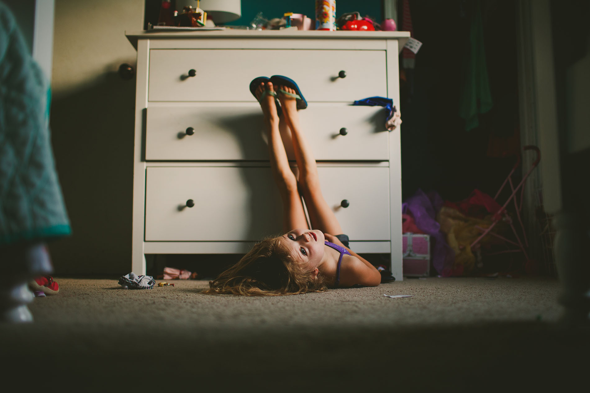
Broad-lighting.jpgbroad light photo of girl laying on her bedroom floor by April Nienhuis
Broad lighting is when the subject’s face is slightly turned away from centre, and the side of the face which is toward the camera (is broader) is in the light. This produces a larger area of light on the face, and a shadow side which appears smaller. Broad lighting is sometimes used for “high key” portraits. This type of lighting makes a person’s face look broader or wider (hence the name) and can be used on someone with a very slim face to widen it. Most people however want to look slimmer, not wider so this type of lighting would not be appropriate for someone who is heavier or round faced.
broad lighting by Darlene Hildebrandt.png
To create broad lighting the face is turned away from the light source. Notice how the side of the face that is towards the camera has the most light on it and the shadows are falling on the far side of the face, furthest from the camera. Simply put broad lighting illuminates the largest part of the face showing.

6. Short Lighting

Short-lighting.jpgshort lighting example by April Nienhuis
Short lighting is the opposite of broad lighting. As you can see by the example here, short lighting puts the side turned towards the camera (that which appears larger) in more shadow. It is often used for low key, or darker portraits. It puts more of the face in shadow, is more sculpting, add 3D qualities, and is slimming and flattering for most people.
short lighting by Darlene Hildebrandt.png
In short lighting, the face is turned towards the light source this time. Notice how the part of the face that is turned away from the camera has the most light on it and the shadows are falling on the near side of the face, closet to the camera. Simply put short lighting has shadows on the largest part of the face showing.